Laura Reigle ’26
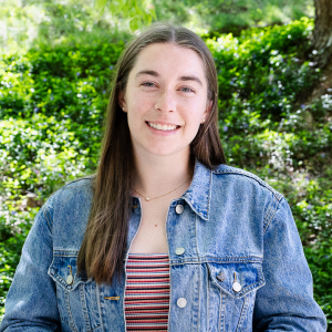
I am a graphic design major with minors in marketing and computer science. I first heard of Lehigh through athletic recruitment for the track and field team, and I was excited to find a strong and growing design program as well. I came into college thinking I wanted to study graphic design, and after my first 2D design class in my freshman fall semester, I knew it was the right path for me. I love learning and asking questions to understand how things work, and the Art, Architecture, and Design (AAD) department continually challenged and inspired me.
Lehigh gave me the opportunity to explore different areas of design, from product design and 3D thinking to web design and coding, as well as experimenting with new mediums through courses like plein air painting. Through all my experiences, I found what I enjoy most about design is seeing ideas come to life, moving from a concept to something tangible in the real world, and I am leaving Lehigh with the skills to not only think creatively, but to make ideas real.
Throughout my time at Lehigh, I also had the opportunity to gain experience with design in many different contexts. I worked with the Athletic Multimedia Department and Lehigh University Art Galleries (LUAG), received a research grant from the College of Arts and Sciences to support a summer research project, and served as a leader within Lehigh’s AIGA (American Institute of Graphic Arts) chapter, helping build community within the department.
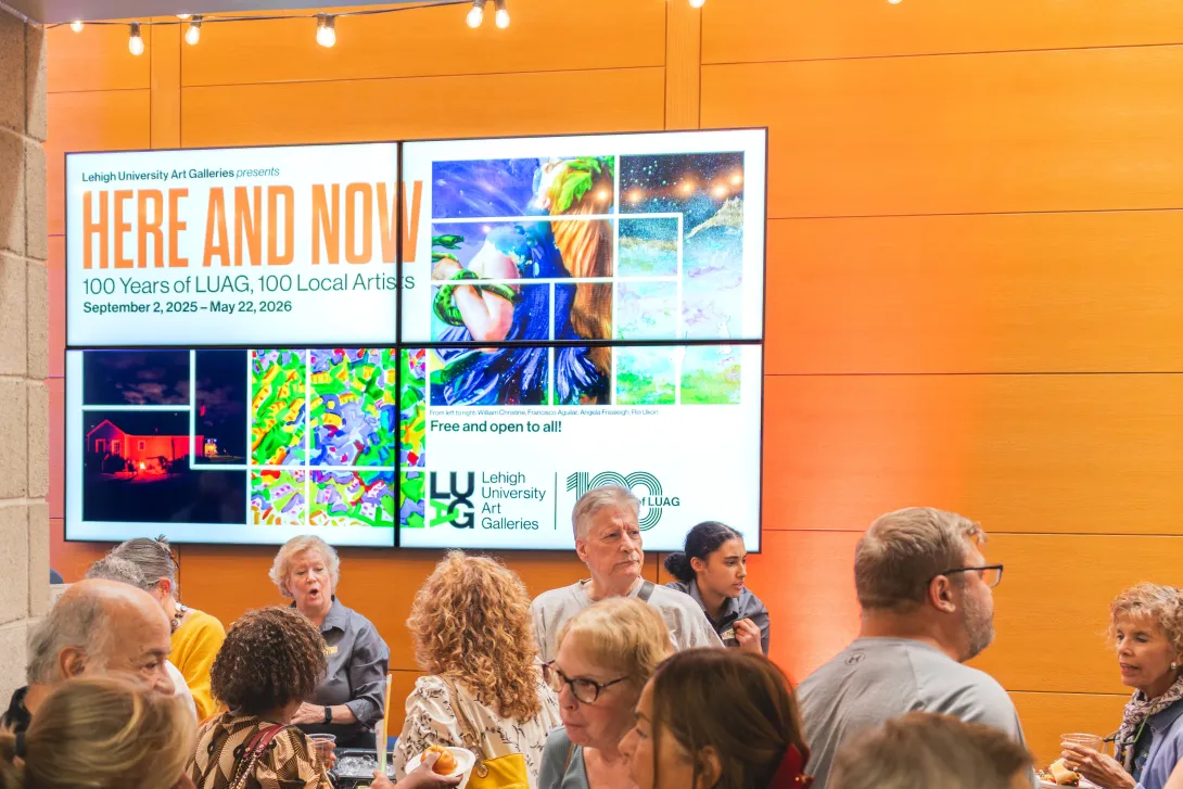
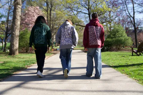
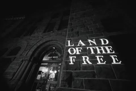
Designed for Lehigh University Art Galleries' centennial exhibition Here and Now: 100 Years of LUAG, 100 Local Artists, this project explores a community centered approach to exhibition branding. The goal was to celebrate the diversity of local artists while highlighting the shared histories and connections that have shaped LUAG and the Lehigh Valley over the past century. The visual identity was developed as part of a collaborative design team, resulting in a bold and flexible system designed to live across both digital and physical environments. The identity was applied to exhibition posters, campus screens, social media templates, billboards, and printed materials throughout Bethlehem, reinforcing a consistent presence across the city. Motion played a key role in extending the system, from animated social media content highlighting artists to a dynamic centennial logo used across platforms.
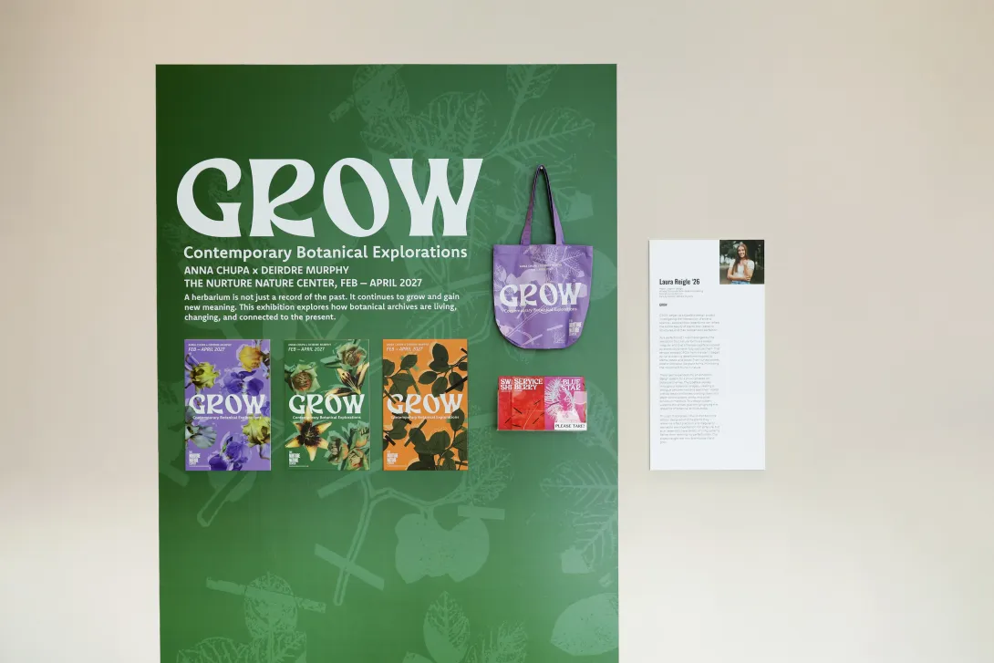
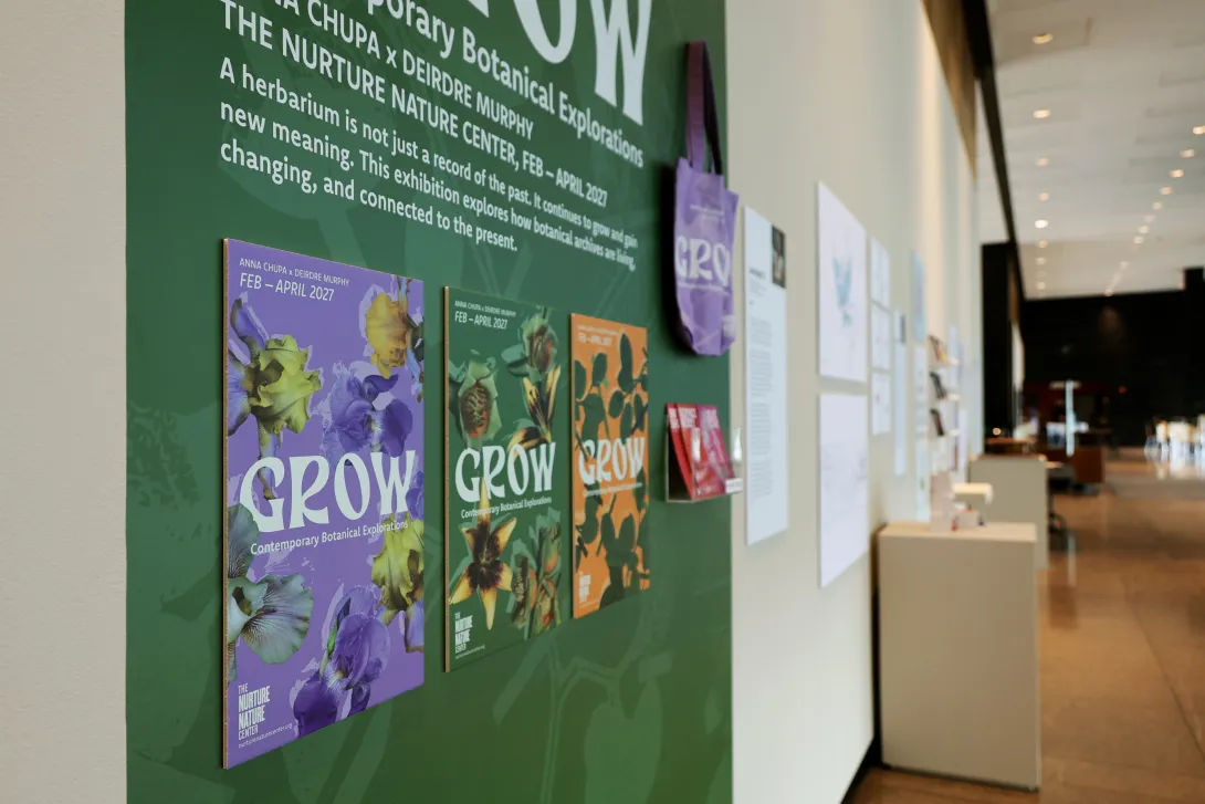
GROW is a typography and design project developed in two phases: the creation of an original typeface inspired by Lehigh University’s Trembley Herbarium and the design of the exhibition identity for GROW: Contemporary Botanical Explorations at the Nurture Nature Center. The Trembley Herbarium contains over 2,000 preserved plant specimens and documents the ecological history of Lehigh’s campus. Inspired by the shapes and structures of East Coast pollinator plants, the typeface combines botanical research with contemporary digital design while connecting plant history to current environmental issues.
The typeface was created alongside prints by Professor Deirdre Murphy, bringing together typography, printmaking, and environmental research. Research for this typeface was supported through the College of Arts and Science Dean’s Creative Arts Grant. The project later expanded into exhibition design through posters, postcards, and a small-scale title wall created as a preview of the full exhibition opening in February 2027 at the Nurture Nature Center. Completed as a Senior Honors Project in Lehigh University’s Art, Architecture, and Design Department, the project shows how design can make archival and environmental research more accessible and engaging for the public.
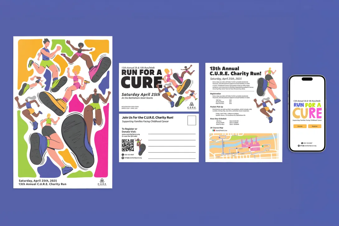
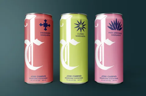
This project explores a hybrid invitation concept for a hypothetical CURE charity run, designed to encourage participation and bring the community together in support of families impacted by pediatric cancer. The goal was to create an experience that feels energetic, welcoming, and action driven, while clearly communicating event details across both physical and digital formats. The design centers around bold illustrations of runners in motion, using a vibrant color palette and expressive character forms to convey movement, individuality, and inclusivity. A folded postcard unfolds into key event information and a poster, acting as both an invitation and a keepsake. A QR code bridges the physical piece to an interactive website, where hand-drawn animation introduces the event before guiding users through registration and donation flows. The final result is a cohesive print to digital system that balances playfulness with purpose. By combining illustration, motion, and thoughtful user pathways, the design creates a memorable entry point into the charity run while amplifying CURE’s mission and motivates users to take action.