Jua Kim ’27

Hi, my name is Jua Kim! I am a 3rd year Graphic Design student here at Lehigh and I am also pursuing a double minor in Marketing and Psychology. From my time at Lehigh, I explored many different areas of design and realized I love both the creative and technical aspects of design. My favorite part of design is being able to research existing and real-world problems and solving that into a visual, meaningful piece.
At Lehigh University, I enjoy being part of the Korean Student Association, OMNI Marketing Club, and getting involved in various graphic and UX design projects. These opportunities that I got to experience heavily contributed in developing my skills as a designer and shaping my perspective beyond the studio. It drives me to step outside of my comfort zone, meet new people, and continue growing both personally and creatively. Outside of design, you can usually find me cooking my favorite foods, binge watching the newest show on Netflix, or exploring new restaurants and cafes!
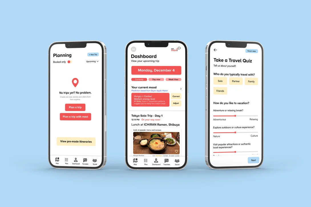
This project was created in a UX/UI course at Lehigh, where we were asked to design a product for the future. I developed Mavi, an AI-powered travel itinerary app that explores how AI can make traveling feel easier and more intuitive.
Mavi focuses on flexibility and personalization, improving on gaps I noticed in existing travel apps. It uses AI to consider things like user preferences, real-time conditions, and context to build and adjust itineraries on the go. One of the main goals was to make it easy to handle unexpected changes, so plans can shift without causing stress.
The prototype is based on a solo trip to Japan, which helped me design more intentional screens and interactions. Focusing on one scenario made it easier to think through how the app would actually respond to real situations and user needs. I learned to think more critically about how emerging technology like AI can be applied in practical, meaningful ways.
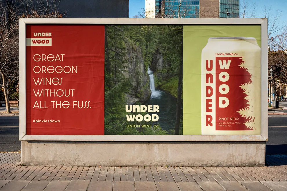
This project features a redesign of an existing beverage brand, Underwood, more specifically their canned wine. I discovered what the brand represents and by investigating the history, value, audience, competitors, and current design language, I built a foundation that supported my creative decisions, which was used throughout the redesign process. The packaging is supported by a brand vision board, a few touch points, and an out-of-home advertisement.
The redesign includes 3 personal illustrations for each of the 3 flavors. It is based on famous locations in Oregon to reinforce the brand’s values and history. It is also made to target a younger and adventurous audience group. This project highlights my ability to innovate on established designs while honoring the spirit of the original brand.
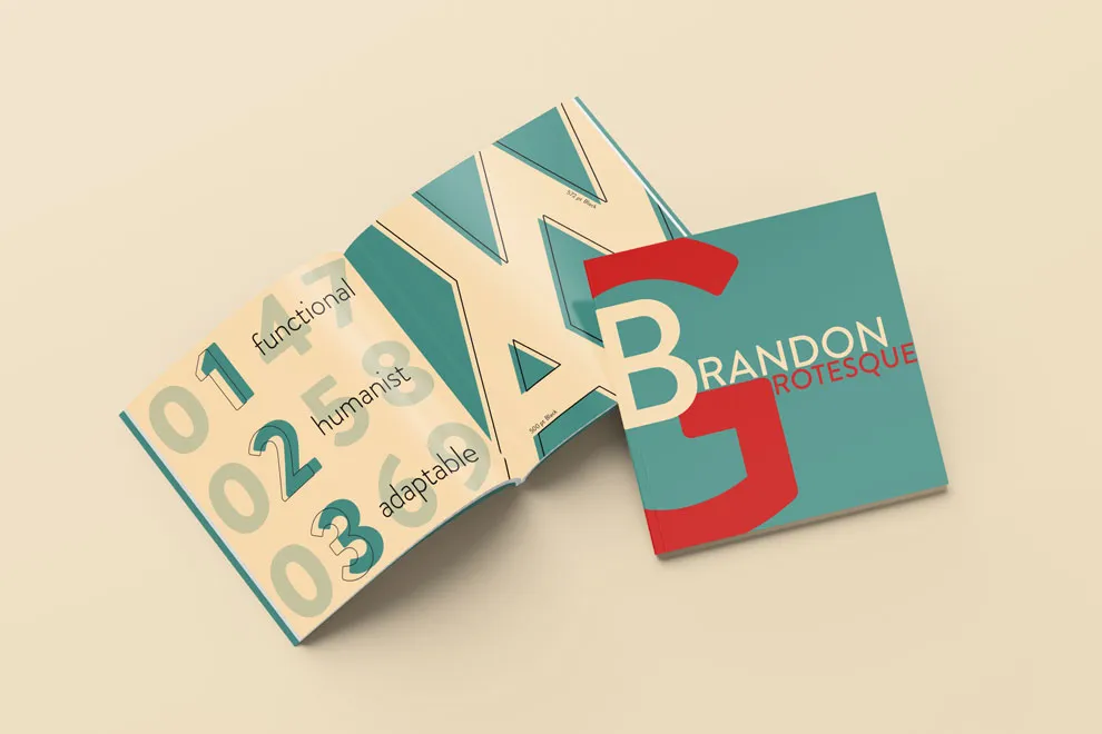
This 16-page type specimen explores the range and personality of Hannes von Döhren’s Brandon Grotesque. Designed as both an informational and visual piece, the book looks at the typeface’s history, structure, and how it can be used in real design contexts.
Rather than just showing letterforms, the publication focuses on how the typeface actually behaves, shifting from bold, expressive display moments to more subtle, readable body text. A consistent grid system and clear hierarchy help organize the content while giving space for the typeface to speak for itself.
Overall, the project is meant to feel both informative and approachable, helping designers better understand not just what Brandon Grotesque looks like, but how it can be used with intention.