Ashley Yoon ’26

My name is Ashley Yoon, and I’m a graphic designer who graduated from Lehigh University in May 2026. Looking back on my time at Lehigh, I feel incredibly grateful for the spaces and people that shaped the way I think creatively.
Over the past few years, I’ve discovered that design is so much more than making something visually appealing. To me, it’s about storytelling, connection, and creating experiences that resonate with people. I’m someone who loves to tell stories reflecting my own life, so I find it especially fitting that my passion lies in storytelling for brands. I’ve been lucky to intern in incredible creative environments, some of which include Neuro, LiveLink Entertainment, and Lehigh University College of Arts and Sciences. Each experience introduced me to new ways of thinking creatively and helped me further develop both my skills and passion for design.
One of the most transformative parts of my college experience was studying abroad in Copenhagen, Denmark during the spring of my junior year. From visiting agencies across Scandinavia to sharing ideas with inspiring professors and peers, I grew to be much more confident as a designer as well as an individual. I truly don’t think my portfolio or perspective would be the same without that experience.
I feel incredibly grateful to Lehigh University for the friendships, experiences, and lessons that I can walk away with. My time here shaped both my creative voice and my confidence as a designer, and I’m excited to carry that into the next chapter of my life.
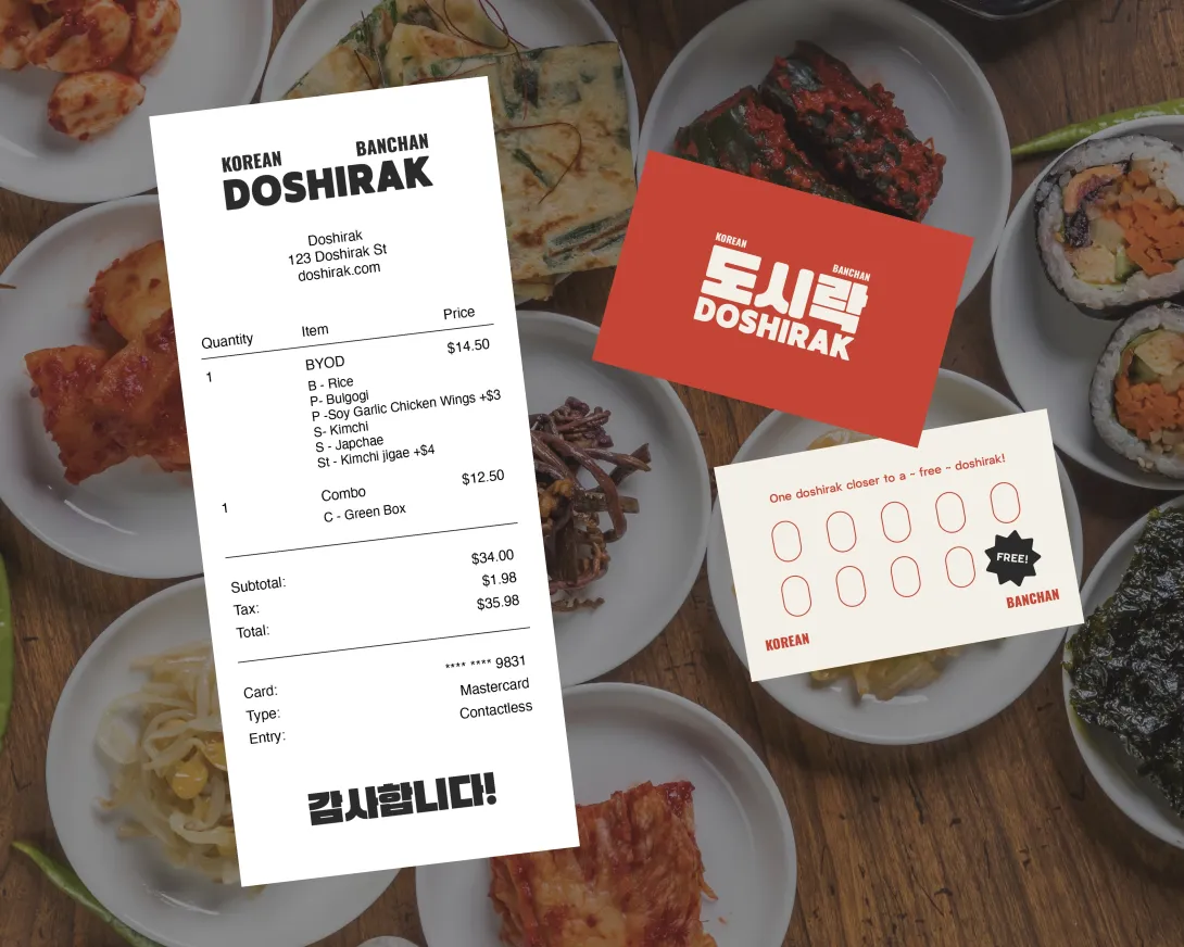
Doshirak is a concept brand identity for a casual Korean restaurant chain built around banchan — side dishes, which are the heart of Korean cuisine. While many global cuisines are represented through niche dining experiences such as ramen bars, sushi spots, or katsu restaurants in Japanese cuisine, Korean food is often narrowly associated with Korean barbecue. Doshirak makes the case that Korean food is more than BBQ, expressed through visual touchpoints across menus, packaging, and storefront design.
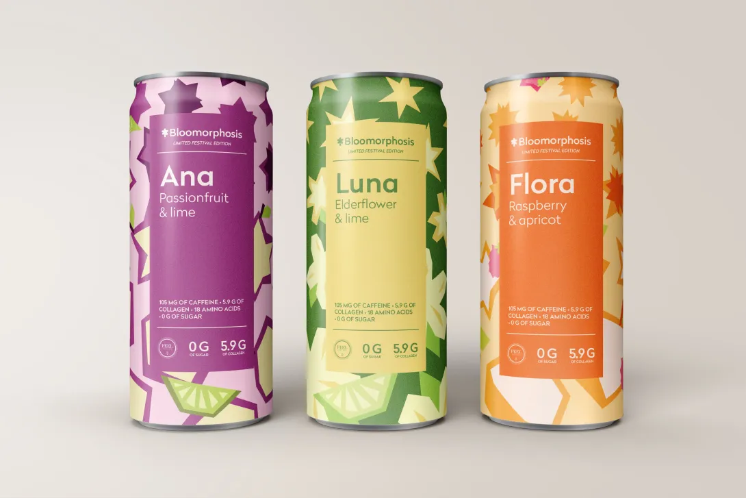
Bloomorphosis was a brand identity project during my study abroad semester in Copenhagen, Denmark. The goal was to create a rebrand for Collab, an existing soda brand, for the Bloom Festival in Copenhagen, Denmark. In addition to the packaging of three cans, I also created posters to help promote the festival, and additional design collateral that made sense for the event - like pins and postcards. I also explored physical deliverables, like creating a magic folder, or “zine”, as well as exploring motion graphics in-depth for the first time.
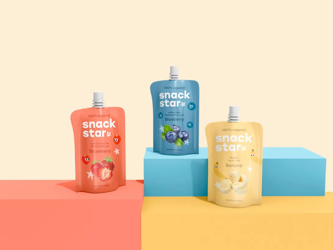
For this project, I created a fun and vibrant visual identity for a children’s snack brand using bold colors, playful graphics, and bright visual elements to create an energetic and memorable experience for both kids and parents. Beyond the packaging design itself, I extended the brand across a physical 4-pack box, social media content, and landing page touchpoints in order to build a cohesive and immersive world around the product. I wanted every part of the brand to feel playful, approachable, and visually engaging while still maintaining a strong and recognizable identity.